In continuation with ‘Why does your Product need a Usability Review?’ , we have done a healthy exercise. We picked some applications randomly, reviewed it, and identified the elements which are leaving the users struggling in some way.
What is Noom?
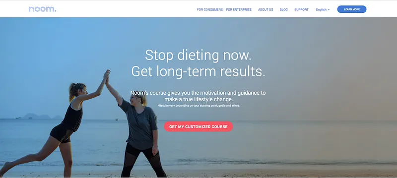
Noom is a health & wellness tech startup that uses mobile technology to help people lead healthier lives. It is a place that gives you the motivation and guidance to make a true lifestyle change, moreover- a kickstart.
Visit them here.
What do we like about Noom?
MOTTO is very generous, motivates healthy living.SERVICE is a much-needed one, providing customised courses to give the motivation to make a lifestyle change.
First Impression
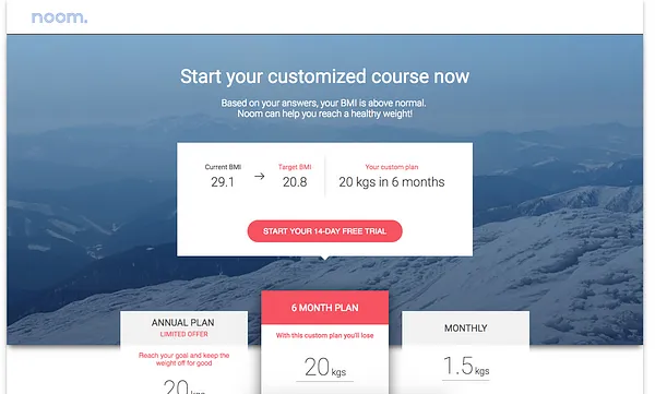
We found the beginning a bit restrictive and presumptuous. Here, the app is making an assumption that:(a) The user knows how much weight they want to/they should lose.(b) The user is here to lose weight.
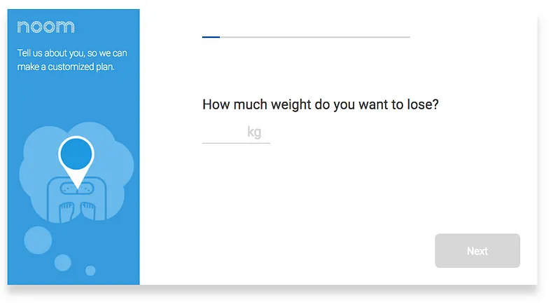
Since the app is promoted as making a lifestyle change, which covers more area than losing weight. If Noom’s target audience is beyond over-weight people, that could somehow be included in the design. Otherwise, the assumption could be a surprise to the user and also prove to be irrelevant in many cases.
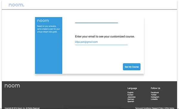
Workflow and Navigation
Many formalities between the user and the goal.
We found that the path towards achieving a user goal is a bit rigid. There are many formalities to be done in order to reach the user’s goal. By each added step, user’s patience is tested.
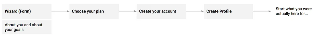
The user, at the beginning of their journey with Noom, is not exposed to the benefit that they are going to receive. Rather, they are forced to get involved in steps like filling the step by step form, choosing the plan, creating account, profile etc. Amidst this hassle, their motivation to use the app gets diluted and hence affects conversion.
User‘s path is driven by the app
It is a very good idea to guide the user by giving the next button, but here- only the next button to navigate further and no other option to navigate to any other area of the product.
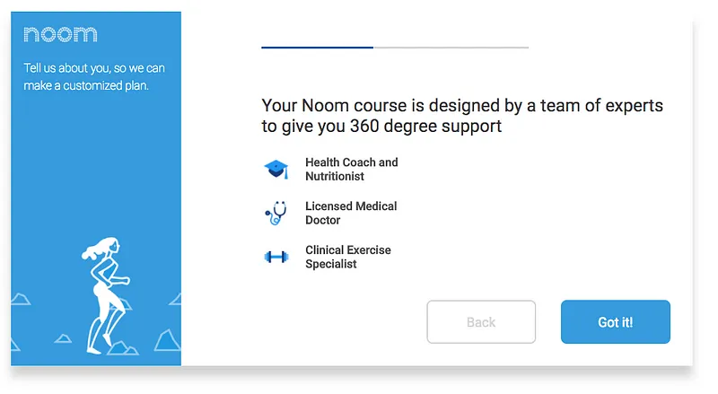
Navigation system acts as a road map, if it is constrained, it suffocates the user and product seem to dominate the user journey. If the navigation is clear, visitors will stay and have a good experience.
Visual Consistency
The pages seem like they don’t pretty much belong to the same family.
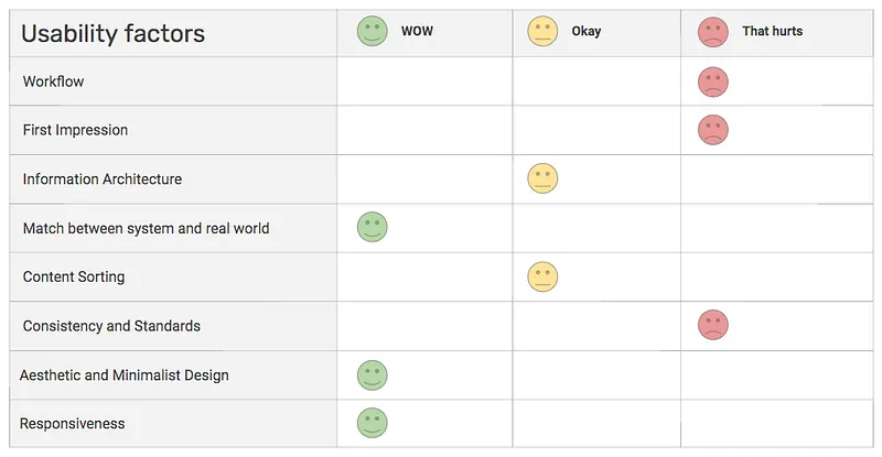
Usability Report Card
This report card summarises which usability factor of the product is impressing the users versus hurting them.
These is just an ounce-full of thoughts on improving the usability. Let me know what you would do differently or suggest for spreading a better experience out there.
Do you own a product?
What do you do for a usability review?
If you do a rigorous user testing, doesn’t that cost a fortune? Well, Usability Review serves the same purpose, the only difference is we could do it for free.
Get a FREE Usability Review done here.
There might not be a lot of WOW moments, but that’s not gonna hurt for sure. Because finding those spots and converting them to WOW is what we are doing this for, isn’t it?
At Aubergine Solutions, we can elevate your product’s user experience with our comprehensive UX Audit and UX Design Services. Our expert team is equipped to deliver data-backed insights and strategic design solutions that resonate with your users and align with your business goals. Contact us today.


Authors


.webp)