This blog post explores the Chip widget, a small but mighty component of the Flutter framework, which you might have already observed but not fully noticed.
We all use the Gmail app in our day-to-day life, and you may have seen Chips in action while composing an email.
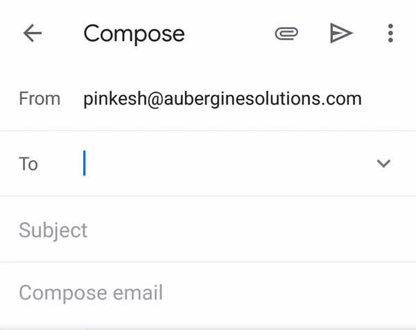
Gmail App from Google
So when we select any name from the list, It gets transformed into something that is visually very compact but shows details of what exactly selected.
That is called ‘Chip’
Chips are compact elements that represent an input, attribute, or action.
Basic Chip widget in Flutter looks like…
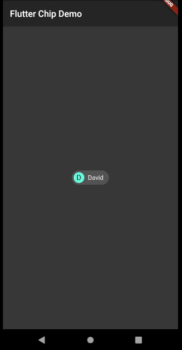
UI structure
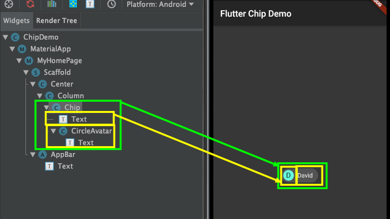
1Chip(
2  avatar: CircleAvatar(
3    backgroundColor: Theme.of(context).accentColor,
4    child: Text('D'),
5  ),
6  label: Text('David'),
7)
Let’s see some of its properties quickly -
ⓛabel: required
It accepts any widget but, Mostly it is good to have Text widget represting name of any entity,action etc.

ⓐvatar:
It accepts any widget and can be used to show image, intial letter of any entity,action etc.

ⓑackgroundColor:
Showing background color of chip when it is unselected and enabled.

ⓛabelStyle:
Used to apply any TextStyle to the label.

ⓛabelPadding:
Adds some padding around the label

ⓔlevation:
It accepts double value and used to elevate the chip

ⓢhadowColor:
Gives color to the shadow of the chip when elevation is set

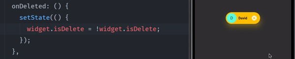
ⓓeleteIcon:
Used to display delete icon. This will be only visible when onDeleted is set.
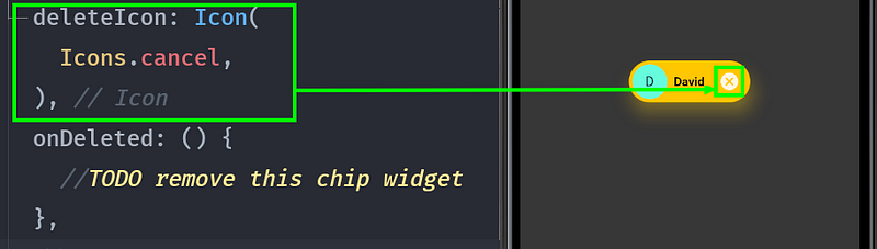
ⓞnDeleted:
It’s a callback when delete icon is pressed inside the chip.
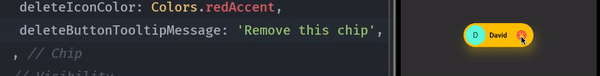
ⓓeleteIconColor:
Color to be set for delete icon

ⓓeleteButtonTooltipMessage:
Set a message to appear on tooltip of delete icon.
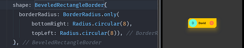
ⓢhape:
Can be used to give shapes to the border of the chip. something like this.
Congratulations!! You have got the basic idea about how Chip widget works in Flutter.
Now let’s see types of chip
➊ Input chips
Input chips represent the information that was presented as part of the selection.
A very common example of this is already shown at the start of this story. i.e Gmail’s composing screen.
It can also be used for showing suggested responses in any messaging app. So that when the user clicks on it, the message contained in the input chip goes as a response.
Example of Input chip with onPressed event.
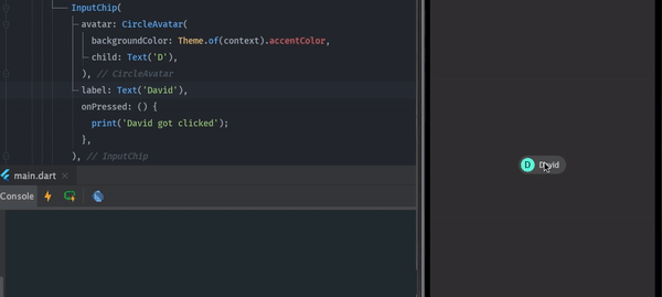
1InputChip(
2  avatar: CircleAvatar(
3    backgroundColor: Theme.of(context).accentColor,
4    child: Text('D'),
5  ),
6  label: Text('David'),
7  onPressed: () {
8    print('David got clicked');
9  },
10)
➋ Choice chips
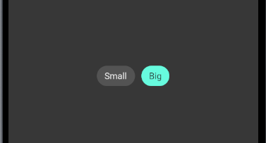
The choice chip allows selecting a single chip from the list. Sometimes it can replace the other widgets which allow single selection like toggle button and radio button.
Example of Choice chip with onSelected event.
1Wrap(
2  children: [
3    ChoiceChip(
4      label: Text('Small'),
5      selected: false,
6      onSelected: (bool selected) {
7        setState(() {});
8      },
9    ),
10    SizedBox(
11      width: 10,
12    ),
13    ChoiceChip(
14      label: Text('Big'),
15      selected: true,
16      onSelected: (bool selected) {
17        setState(() {});
18      },
19      selectedColor: Theme.of(context).accentColor,
20    ),
21  ],
22)
➌ Filter chips
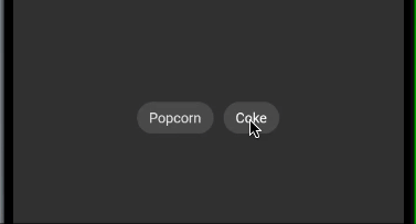
Filter chip contains options, attributes, categories so that users can filter from it. You can easily replace the checkbox with Filter chip.
Example of Filter chip with onSelected event.
1Wrap(
2  children: [
3    FilterChip(
4      label: Text('Popcorn'),
5      selected: false,
6      onSelected: (bool selected) {
7        setState(() {});
8      },
9    ),
10    SizedBox(
11      width: 10,
12    ),
13    FilterChip(
14      label: Text('Coke'),
15      labelStyle: TextStyle(
16          color: widget.isSelected ? Colors.black : Colors.white),
17      selected: widget.isSelected,
18      onSelected: (bool selected) {
19        setState(() {
20          widget.isSelected = !widget.isSelected;
21        });
22      },
23      selectedColor: Theme.of(context).accentColor,
24      checkmarkColor: Colors.black,
25    ),
26  ],
27)
➍ Action chips
Action chips can be used to invoke some action on primary content. It can not be disabled because if it is not needed then it should not even available to users.
For example, the user can take action like playing or downloading the song.

1Wrap(
2  children: [
3    ActionChip(
4      label: Text('Play'),
5      onPressed: () {
6        //TODO
7      },
8    ),
9    SizedBox(
10      width: 10,
11    ),
12    ActionChip(
13      avatar:
14          widget.isSelected ? CircularProgressIndicator() : null,
15      label: Text(
16          '${widget.isSelected ? 'Downloading...' : 'Download'}'),
17      labelStyle: TextStyle(color: Colors.white),
18      onPressed: () {
19        setState(() {
20          widget.isSelected = !widget.isSelected;
21        });
22      },
23    ),
24  ],
25)
That looks like you have learned a lot today.
Full code can be found here
1import 'package:flutter/cupertino.dart';
2import 'package:flutter/material.dart';
3
4class ChipDemo extends StatelessWidget {
5  @override
6  Widget build(BuildContext context) {
7    return new MaterialApp(
8      darkTheme: ThemeData.dark(),
9      theme: ThemeData(brightness: Brightness.dark),
10      title: 'Flutter Demo',
11      home: new MyHomePage(title: 'Flutter Chip Demo'),
12    );
13  }
14}
15
16class MyHomePage extends StatefulWidget {
17  MyHomePage({Key key, this.title}) : super(key: key);
18
19  final String title;
20  bool isDelete = true;
21  bool isSelected = false;
22
23  @override
24  _MyHomePageState createState() => new _MyHomePageState();
25}
26
27class _MyHomePageState extends State<MyHomePage> {
28  int _value = 1;
29
30  final List<ActorFilterEntry> _cast = <ActorFilterEntry>[
31    const ActorFilterEntry('Aaron Burr', 'AB'),
32    const ActorFilterEntry('Alexander Hamilton', 'AH'),
33    const ActorFilterEntry('Eliza Hamilton', 'EH'),
34    const ActorFilterEntry('James Madison', 'JM'),
35  ];
36  List<String> _filters = <String>[];
37
38  Iterable<Widget> get actorWidgets sync* {
39    for (ActorFilterEntry actor in _cast) {
40      yield Padding(
41        padding: const EdgeInsets.all(4.0),
42        child: FilterChip(
43          avatar: CircleAvatar(child: Text(actor.initials)),
44          label: Text(actor.name),
45          selected: _filters.contains(actor.name),
46          onSelected: (bool value) {
47            setState(() {
48              if (value) {
49                _filters.add(actor.name);
50              } else {
51                _filters.removeWhere((String name) {
52                  return name == actor.name;
53                });
54              }
55            });
56          },
57        ),
58      );
59    }
60  }
61
62  @override
63  Widget build(BuildContext context) {
64    return new Scaffold(
65      appBar: new AppBar(
66        title: new Text(widget.title),
67      ),
68      body: new Center(
69        child: Column(
70          mainAxisSize: MainAxisSize.min,
71          children: <Widget>[
72            Visibility(
73              visible: widget.isDelete,
74              child: Chip(
75                label: Text('David'),
76                avatar: CircleAvatar(
77                  backgroundColor: Theme.of(context).accentColor,
78                  child: Text('D'),
79                ),
80                backgroundColor: Colors.amber,
81                labelStyle:
82                    TextStyle(color: Colors.black, fontWeight: FontWeight.bold),
83                labelPadding: EdgeInsets.all(8),
84                elevation: 16,
85                shadowColor: Colors.amberAccent,
86                deleteIcon: Icon(
87                  Icons.cancel,
88                ),
89                onDeleted: () {
90                  setState(() {
91                    widget.isDelete = !widget.isDelete;
92                  });
93                },
94                deleteIconColor: Colors.redAccent,
95                deleteButtonTooltipMessage: 'Remove this chip',
96                shape: BeveledRectangleBorder(
97                  borderRadius: BorderRadius.only(
98                      bottomRight: Radius.circular(8),
99                      topLeft: Radius.circular(8)),
100                ),
101              ),
102            ),
103            Chip(
104              label: Text('David'),
105              avatar: CircleAvatar(
106                backgroundColor: Theme.of(context).accentColor,
107                child: Text('D'),
108              ),
109              backgroundColor: Colors.amber,
110              labelStyle:
111                  TextStyle(color: Colors.black, fontWeight: FontWeight.bold),
112              labelPadding: EdgeInsets.all(8),
113              elevation: 16,
114              shadowColor: Colors.amberAccent,
115              deleteIcon: Icon(
116                Icons.cancel,
117              ),
118              onDeleted: () {
119                setState(() {
120                  widget.isDelete = !widget.isDelete;
121                });
122              },
123              deleteIconColor: Colors.redAccent,
124              deleteButtonTooltipMessage: 'Remove this chip',
125              shape: BeveledRectangleBorder(
126                borderRadius: BorderRadius.only(
127                    bottomRight: Radius.circular(8),
128                    topLeft: Radius.circular(8)),
129              ),
130            ),
131            SizedBox(
132              height: 50,
133            ),
134            InputChip(
135              avatar: CircleAvatar(
136                backgroundColor: Theme.of(context).accentColor,
137                child: Text('D'),
138              ),
139              label: Text('David'),
140              onPressed: () {
141                print('David got clicked');
142              },
143            ),
144            InputChip(
145              label: Text('Wifi'),
146              labelStyle: TextStyle(
147                  fontSize: 20,
148                  color: widget.isSelected ? Colors.black : Colors.white),
149              padding: EdgeInsets.all(16),
150              pressElevation: 25,
151              onSelected: (isSelected) {
152                setState(() {
153                  widget.isSelected = !widget.isSelected;
154                });
155              },
156              selected: widget.isSelected,
157              selectedColor: Colors.amber,
158              selectedShadowColor: Colors.amber[200],
159              checkmarkColor: Theme.of(context).accentColor,
160            ),
161            Wrap(
162              children: [
163                ChoiceChip(
164                  label: Text('Small'),
165                  selected: false,
166                  onSelected: (bool selected) {
167                    setState(() {});
168                  },
169                ),
170                SizedBox(
171                  width: 10,
172                ),
173                ChoiceChip(
174                  label: Text('Big'),
175                  selected: true,
176                  onSelected: (bool selected) {
177                    setState(() {});
178                  },
179                  selectedColor: Theme.of(context).accentColor,
180                ),
181              ],
182            ),
183            Wrap(
184              children: [
185                FilterChip(
186                  label: Text('Popcorn'),
187                  selected: false,
188                  onSelected: (bool selected) {
189                    setState(() {});
190                  },
191                ),
192                SizedBox(
193                  width: 10,
194                ),
195                FilterChip(
196                  label: Text('Coke'),
197                  labelStyle: TextStyle(
198                      color: widget.isSelected ? Colors.black : Colors.white),
199                  selected: widget.isSelected,
200                  onSelected: (bool selected) {
201                    setState(() {
202                      widget.isSelected = !widget.isSelected;
203                    });
204                  },
205                  selectedColor: Theme.of(context).accentColor,
206                  checkmarkColor: Colors.black,
207                ),
208              ],
209            ),
210            Wrap(
211              children: [
212                ActionChip(
213                  label: Text('Play'),
214                  onPressed: () {
215                    //TODO
216                  },
217                ),
218                SizedBox(
219                  width: 10,
220                ),
221                ActionChip(
222                  avatar:
223                      widget.isSelected ? CircularProgressIndicator() : null,
224                  label: Text(
225                      '${widget.isSelected ? 'Downloading...' : 'Download'}'),
226                  labelStyle: TextStyle(color: Colors.white),
227                  onPressed: () {
228                    setState(() {
229                      widget.isSelected = !widget.isSelected;
230                    });
231                  },
232                ),
233              ],
234            ),
235            Column(
236              mainAxisAlignment: MainAxisAlignment.center,
237              children: <Widget>[
238                Wrap(
239                  children: actorWidgets.toList(),
240                ),
241                Text('Look for: ${_filters.join(', ')}'),
242              ],
243            ),
244            ActionChip(
245                avatar: CircleAvatar(
246                  backgroundColor: Colors.grey.shade800,
247                  child: Text('AB'),
248                ),
249                label: Text('Aaron Burr'),
250                onPressed: () {
251                  print(
252                      "If you stand for nothing, Burr, what’ll you fall for?");
253                })
254          ],
255        ),
256      ),
257    );
258  }
259}
260
261class ActorFilterEntry {
262  const ActorFilterEntry(this.name, this.initials);
263  final String name;
264  final String initials;
265}
Conclusion:
The Chip widget, which we discussed in this post, is a vital and multifaceted component of the Flutter toolkit that allows developers to make UI components interactive and dynamic with ease. From input and choice chips to filter and action chips, the possibilities are as limitless as your creativity.
Remember, the Chip widget isn’t just about aesthetics; it’s about functionality and user experience. By implementing Chips thoughtfully, you can significantly enhance the way users interact with your app, making the experience both enjoyable and efficient.
Are you ready to take your app to the next level? At Aubergine Solutions, we specialize in crafting custom solutions that stand out in the digital landscape. Whether you’re looking to integrate the Chip widget into your existing app or seeking comprehensive Flutter app development services, our team of experts is here to transform your vision into reality. Contact us today.
If you enjoyed reading this blog, then do explore our other posts too:
Mastering Dart’s Extension Methods for Enhanced Flutter Development
Designing a Custom Notebook Page in Flutter with CustomPaint
Quick Guide to Crafting an Onboarding Page Indicator in Flutter


Authors

Pinkesh Darji
More ways to listen


Podcast Transcript


.webp)